top of page
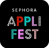
SEPHORA APP FEST
BRAND IDENTITY ART DIRECTION
MARKETING BRIEF /
Create a unique identity to highlight the Sephora App’s annual promotional week.
ART DIRECTION /
Channeling the iconic rhythm of shape and grid that Bauhaus brought to life, we’re crafting a bold lockup and dynamic graphic forms to fuel a visually striking and instantly recognizable campaign experience.
Art Direction: Nathan Corbin / ACD: Sarah Berends / CD: Leah Kim / Editorial Direction: Kristi Mikesky, Kat Thomsen / Marketing Lead: Briana Balaban
SOUND ON
FOR BLONDIE 👉
/ / / / 30 SECOND MAKING OF VIDEO / / / /
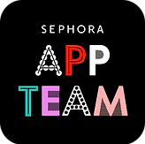
THE LOGOS / To build a brand identity that gains traction and widespread recognition across hundreds of touchpoints, we leaned into heavy logo usage with pink background as essential elements.


LOGO IDENTITY GROWS / I loved seeing the logos adapt to French and in-store "App Team" uniforms without straying from original Bauhaus-Pop look.

SHOWN WITH AI BECAUSE I NEVER GOT A TEE! 😭😭
👩🎨: "OUI OUI, JE VEUX TOUT LE MAQUILLAGE"

/ / / / PERFORMANCE / / / /
“App Fest is breaking records – 6 days into the 8-day event US dotcom has already beat forecast by +32% and achieved nearly 2x YoY growth, delivering $11M in demand sales thru yesterday! This is now our BIGGEST App Week to date, outpacing our March 2025 event by a landslide, which drove $8.6M.”
/ / / / TOUCHPOINTS / / / /
More Portfolio Spolights // 1. "Pride" global campaign for Dockers // 2. Design Direction for Apple // 3. "Creators" Seasonal Art Direction for Dockers // 4. 3D Customization Experience for Levi's // 5. Product Drop Direction for Dockers // 6. World Water Day Campaign for Dockers
bottom of page